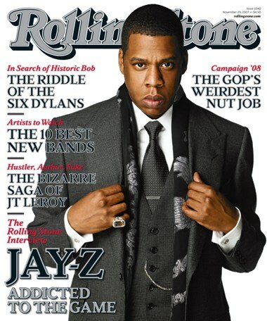
The mass media is a major factor to consider when brainstorming and creating graphic artwork. With the mass media in mind, the designer is able to create art pieces that contribute to specific cause or event occurring in society. This also helps the designer when thinking of ideas and concepts to include into their artwork that would be viewed as “catchy” or an “eye-opener” to the various people that will see it. In terms of type and visual quality, the “Vogue”, “Herald Tribune“, “Life”, “Seventeen”, and “Rolling Stone” magazine covers are examples that express the notion that photos are another alternative to stimulate the audience and grab their attention instead of only choosing from various fonts and letterheads. The previous examples interested me in terms of attracting certain age groups and cultures to a specific work of art/design. Books, magazines, and newspaper covers all require dynamic cover pages, which will grab the attention of a large audience due to their curiosity of discovering what the written passage is about. Each of the artist/designers for these covers had to take into consideration catch phrases, fonts, typefaces, and pictures that were going to “stand out” or correlate to the trends and fads of their specific time period(s). Based on the various examples projected in the media, it is the designers’ responsibility to create works that will stimulate the viewer and grab their undivided attention.


As people are pressed for time, only the things that immediately catch our eye capture our attention. This goes for ads, magazine covers, product packaging etc.
ReplyDeleteIt's crazy how quickly people will 'judge a book by its cover'(this also goes for magazines, packages, etc). But this is why people need designers! Because they don't know how to capture people's attention, and we have learned how to!
ReplyDeleteI can understand the need to grab attention, but everyone trying to outdo everyone else can lead to visual static. The only magazine I would likely take time to read the cover would be the Life magazine.
ReplyDeleteLooking at your examples got me thinking.. It'd catch my eye more if a fashion magazine didn't put a person on the cover, just because it's so standard now. Even if they showed a pair of legs with crazy new shoes on them, it would be very unexpected.
ReplyDeleteI actually find the cover for Seventeen to be really obnoxious, but then again I guess it suits people in that age group!
ReplyDeleteI agree with a lot of these comments. Magazines like these start to all look the same at some point. I'm ready for a change.
ReplyDeleteI like Interview magazine and they 'attention-grabbing' layouts and design they use, but I like that Vogue cover and the look of the pink over the sparkle of the diamonds.
ReplyDeleteThat Seventeen cover is kind of an eyesore. (And I say this as someone who used to subscribe to it way back in the day. I preferred the multicolored sans serif font they used then as opposed to this...whatever this is now. *shakes walker at the youngsters these days*) I like that both Life magazine and Rolling Stone magazine arrange the text in such a way as to let the images breathe. (Though I guess it also helps that they don't attempt to advertise the entire contents of their magazine on their covers, like the other two seem to be doing!)
ReplyDeleteI agree with the majority of these comments. A lot of the magazines look very similar that when all on the shelves no one really stands out because they all look a like.
ReplyDeleteI agree with Sora's comment about the Seventeen magazine. I feel like it is reflective of the young demographic that would be attracted to bright colors and almost chaotic layout. Unlike the Vogue layout that I think is very clean and organized, targeting a more mature audience.
ReplyDeleteI see that a few of the examples that you provided match up the font color with the shirt color of the model, and that color seems to always be a bright neon color.
ReplyDeleteI agree that it is time for a change as far as creating a new way to grab peoples attention is concerned, or at least do a little more than just play up the hot pink tank top that beyonce wears...ya know?!
a lot of people flip through magazines very quickly skimming them for info that they care about. so, i agree with Keith.
ReplyDeleteI find that the style magazines to look very chaotic and are overwhelming to look at, but I find the things that are the loudest on the page are the things I remember the most. I think style magazines could benefit from a new design layout.
ReplyDeleteI agree with Shanna and Nina. It is time for a change. It is a visual overload that their messages get lost.
ReplyDeleteI agree with Nina, lets start a revolution! Change starts with us!
ReplyDeleteWhat John said! I'm with that.
ReplyDeletehaha I agree time for a change because most of the eye catching covers aren't telling you about the information you actually care about.
ReplyDeletei personally like looking at magazine covers to try and determine what photoshop tools were used, and which part of the body. while i don't agree with how people on covers are hyper-stylized, i do admire the artist's photoshop-chops.
ReplyDeleteI completely agree with Katie! But, I absolutely love looking at magazine/catalogue layouts, the good ones anyways.
ReplyDelete