Friday, April 29, 2011

My pencil.My paper.

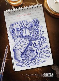
I had a hard time finding something that I was interested in blogging about this week. Then I came across the ad for Career Junction. The use of text as image works very well in this ad. The artist used everyday items in their same likeness while defining each with the word in such a clever way. I particularly like that the juice isn’t bottled.

The ad also reminded me of how I have grown in my art skills over the years. I have noticed the decrease in my use of elaborate drawing/sketching in detail on paper. I believe that drawing and painting, and even sculpting is ultimately how an artist begins their artistic journey. In the beginning, a hands-on aspect is abundant in every artist. I sometimes have to remind myself that the computer is not the only way to design. Design is done with so many different mediums today. That is why I believe design is good for illustrating whatever you may come up with in your head with the use of many different techniques to choose from. In the past, everything was done on paper first. Graphic designers today have the choice of sketching out ideas first on paper or just jumping right in and rendering it in any program of their choice. Has the importance of pencil and paper decreased over the years? For some designers, maybe; others would definitely fight for their pencil and paper! I know I would.


Wednesday, April 27, 2011

logo stripdown!


An interesting series of paintings that I came across by an artist who goes simply by "Dorothy". These paintings showcase the graphic elements of well-known logos stripped of the text. I am able to recognize the majority of the logos, however some were more easily recognizable than others. Without the text, I find that I focus more on the logo and the simplicity behind them. In all of these examples it seems that the text plays a big part in the logo as all of the designs are simple geometric shapes.

Although this particular topic is not what I am focusing on for the final project, it is still interesting to see the logos and how blank they seem without the words and fonts that make them come to life. It would be interesting to do a study where something small is altered about a well-known logo to see how drastic the overall tone or reorganization of the logo changes. Are you able to recognize the logos without their text? Do you feel that the images are stronger with or without the text??


Tuesday, April 26, 2011

The Edible Business Card

business-cards-06

I have decided that my project is going to be an accumulation of all the things that I personally have an access of such as DVDs, VHS tapes, CDS, Shoes, empty water bottles, beanie babies, printed pictures, and a few other things. This accumulation of items will be built up to form a sculpture or a large pile of crap to show how much stuff a person has that is just excess to their existence. If I build a sculpture I’m not sure if I will disassemble the items or leave them whole (I’m not trying to cut up my shoe collection, I may hate wearing them but I love looking at them, they’re just so pretty) and as far as the structure itself it needs more research. But I feel as though a giant pile might be more affective in showing the amount of access stuff.

Also, while stumbling the internet, I have come across a number of sites that talk about creative business cards. I came to this blog called www.youthedesigner.com it has a number of interesting things to look at and get inspiration from as well as jobs and informational things. I came across some interesting creative business cards; I love creative out of the box ones. With the invention of smart phones and the internet more and more people when they receive a business card just import it into their phone or computer and throw away the physical card and some even just google it. One of the cards I found interesting was for Bombay Bakery. I found this idea particularly creative for two reasons, one for those who do just import the information they have a light snack and two the card is promoting a bakery and it’s editable, hopefully it tastes good. Business cards are still important especially for designers even if some of them are just going to get thrown away.

Arizona State University - gang affiliation?


So, an ongoing theme that has been brought up all throughout my education in graphic design is been bad design. apparently, bad design is inevitable and inescapable. normally, I would expect this to come from people who are not practicing design who attempt to do their own designs, however, sadly the spectrum runs more vast than that. professional designers and firms are guilty of this too, and it is kind of sad.

Example: ASU (Arizona State University) has recently changed their image for their athletic department, the Sun Devils. They (ASU) have teamed up with Nike and have created a new campaign featuring new logos, along with other various elements. However, the new logo portion is the important aspect here. It has been recently brought to light by an ASU Alum and current Chicago police officer (who is on the Chicago Gang Task Force) that ASU's new "pitchfork" logo is dangerously similar to the pitchfork symbol used by chicago gang, Satan's Disciples. This is really bad, because the SD's (Satan's Disciples) have now adopted the ASU style pitchfork as their own, and have started wearing ASU hats and tshirts. The police are now concerned, because ASU comes to town often to participate in sports events against UofI, and others. They are scared that an ASU student or family will attend wearing these hats and shirts, and then get beat up or much worse by the Latin Kings, who are rivals of Satan's Disciples.

When brought to the ASU board, this issue was "laughed at" in a way, because ASU and Nike both agree that they do not see any similarities. they don't feel it is a problem. When told it was bad design and not "thought through" on their part, they disagreed.

What do you think about this?

Will Work For Free

I don't know about any of you guys, but lately I've been receiving a lot of requests for free design work...and no, they're not from my family or close friends. Instead, it's been from people offering me a great 'opportunity' that would be not only a great experience, but also a solid addition to my portfolio. Now, let's take a step back and ponder two questions. First, why is it that people think that design is something that should be done for free? And at what point does my previous experience as a designer warrant fair payment for my work? These questions come up frequently, especially now as most of us are getting uncomfortably close to graduating.

Now let's be honest, none of us are getting into design because we expect to make boatloads of cash. But, on the other hand, I'm spending a lot of money on my education...at what point should I expect to have an income!? Is it just me, or are designers getting taken advantage of more than ever? To be honest, I don't know the answer to most of these questions, and who knows when (if ever) those outside the design community will come to their senses and pay us for what we are worth. I can tell you one thing, I'm getting very nervous to enter a work environment like this, especially as a new graduate.

The Mass Media's Influence

The mass media is a major factor to consider when brainstorming and creating graphic artwork. With the mass media in mind, the designer is able to create art pieces that contribute to specific cause or event occurring in society. This also helps the designer when thinking of ideas and concepts to include into their artwork that would be viewed as “catchy” or an “eye-opener” to the various people that will see it. In terms of type and visual quality, the “Vogue”, “Herald Tribune“, “Life”, “Seventeen”, and “Rolling Stone” magazine covers are examples that express the notion that photos are another alternative to stimulate the audience and grab their attention instead of only choosing from various fonts and letterheads. The previous examples interested me in terms of attracting certain age groups and cultures to a specific work of art/design. Books, magazines, and newspaper covers all require dynamic cover pages, which will grab the attention of a large audience due to their curiosity of discovering what the written passage is about. Each of the artist/designers for these covers had to take into consideration catch phrases, fonts, typefaces, and pictures that were going to “stand out” or correlate to the trends and fads of their specific time period(s). Based on the various examples projected in the media, it is the designers’ responsibility to create works that will stimulate the viewer and grab their undivided attention.


Monday, April 25, 2011

Video Poetry

This week, I am posting about two videos that are worth taking a look at. "Symmetry" and "Words" by Everynone, made to accompany Radiolab's shows by the same titles.

http://www.good.is/post/intermission-words-a-video-poem/

http://www.good.is/post/intermission-everynone-s-stunning-symmetry-video/

Aside from the interesting photography and camera choices in both videos, I think it is particularly interesting to us a designers how the artists compile these pieces and make them flow. I saw "Words" first, and it took a little while to really see how each thing transitioned. The more times you watch it though, the more it makes sense and is interesting to see the different words represented that are being represented through the visuals.

Although these are videos, I think we can use some of these ideas in print design as well. The idea that there are so many ways to interpret different words is particularly applicable. It might be cliche to represent chaos by showing football players watching their coach draw out plays, but when that transitions with children jumping and playing in circles, do we still see it as chaotic? How it time represented? at 1:42 in the "Symmetry" video, we see 2 clocks - both at 9:01. But one is analog and one is digital, and (at least for me) I associate the analog with daytime and the digital with nighttime. This is just one example of how these images can convey meaning that they may not even intend. It's important that we look at what we're designing and think "what else could this mean?" and "how can I represent this visually?" instead of just assuming that everyone will see what we see and that what we intend is what is being seen.

There are many more videos to enjoy on their website http://everynone.com/

Flaxman Library

Because I am designing a book, as per Delores' suggestion, I visited the School of the Art Institute's Flaxman library. Just below the main library's collection on the sixth floor sits their Artist's collection. In it resides hundreds of created and non-conventional books. The lady who works there had pulled several books that showcased a certain amount of interactivity. The books were all extremely delicate, and I was only allowed to handle them after I'd washed my hands. There were card set books, accordion books, spiral books, and even a book made using legos.

It's tough to pick one book that stood out among the rest. I think the best books were those that incorporated various styles... like the books that had cut-outs, 3-D elements, and various binding types.

What also stood out to me were the story lines in the books. Not every book's intention or story was perfectly clear, but each book did communicate something. And as for my project, that's kind of where I'm stuck at the moment. I'm having trouble creating the details... what to communicate while answering the core questions of the class.

I don't have a photo for this post, but I do suggest visiting the library (37 s. Wabash, 5th floor) or at least visiting the website below. :)


http://www.saic.edu/degrees_resources/libraries/flaxman/index.html

Type + Olympics


I have been thinking and trying to gain more ideas for inspiration on my Olympic theme for my capstone project. I have decided that I am going to design three campaigns for three different cities one of them being Chicago. Something that I want to bring into my project is typography.

I have always been fascinated with the opening and closing ceremonies of the Olympics and have always wanted to actually be there. I found this typographic piece that uses the Olympic rings and their colors to say something about the ceremonies. It gives me inspiration for my project as well as some ideas. I also want to incorporate a lot of color when doing this and design new logos for each of the cities I choose.

My plan is to completely re-design the Chicago logo and take inspiration from some of the ones in the second poster. I love that the colors of the Olympic rings are used in these posters and want to further explore the colors with typography for my capstone project. If anyone has any ideas on other cities they think would be good for me to do I will take all the ideas I can get as I still do not know what other cities I will be doing but I really want them to NOT be in the United States.

Sam's Myth

One of my family members actually brought this blog to my attention. Sam Smith is a graphic designer and a musician. He has his own blog called Sam’s Myth where he posts some of his work and comments on other graphic designers work. Recently he has created movie posters for his own Top 10 of 2010 Poster Project. His goal was to design ten posters for his ten favorite movies of the year as an exercise in liberation. He wanted to try new unorthodox ideas, work on his hand-drawing and lettering, things he said he neglected and needed an excuse to work on. His main goal was to embrace the process, he wanted to get some ideas down, whether they had potential or not. Throughout his process he made it a point to not spend more time on one poster than the other. Here are some of his top 10 of 2010 posters.


After reading his blog and looking at the 10 posters he did for his project I think it is an innovative exercise. In his blog he states that “ it was a creative project that paid tribute to the films that affected me the most this year”. Taking something you are passionate about, like films and incorporating that into an exercise to challenge yourself can only help you improve your skills. I believe that my skills and work could greatly improve from exercises similar to this. Even if all of the work that comes out of the process is not my favorite, it still can improve my design skills in may ways.

ATROPOLIS

I want to take a break from talking about my design values and my project this week and promote Atropolis. I'm sure some of you have heard of and attended Atropolis so if you have, please feel free to discontinue reading and skip right to commenting about your experience. But if you haven't, please try to find time this weekend to go! It's a huge, amazing, get-so-lost-but-you-don't-care 3-floor event at the Merchandise Mart with floors dedicated to Art Chicago, NEXT, and the Antiques Fair. Art Chicago features international contemporary and modern art, NEXT is more cutting-edge stuff, and the Antiques Fair is pretty self-explanatory. Last year was my first time experiencing Atropolis and I was completely blown away. I was definitely unprepared for the amount of artwork displayed (and I only had time to visit the Art Chicago floor). My roommate and I wandered around for about 6 hours and saw everything from light installations to black and white portraits of old celebrities to modern paintings and drawings. The best part is, there are many opportunities to experience all of it for FREE! The easiest way is to type in the promo code "FRIEND" in the tickets link below and you can get up to 20 free tickets for the entire weekend...amazing! Also check out the special events they have each day. I'll be there Saturday and Sunday so maybe i'll run into a couple of you! (I ran into Mark Zlotkowski last year for any of you printmakers.)

tickets: https://www.microspec.com/tix123/etic.cfm?code=artrop11

more info: http://www.artropolischicago.com/#

Masters of Spacial Reasoning


I have a particular love for small homes, I think for the same reason I enjoy vegan cooking even though I eat meat. It's exciting to see how innovative people get when given restrictions on a project. Personally, restriction often does more to motivate me than complete freedom. (What would you do with the prompt, "make a manifesto using no text"?) It's a shortcut to problem solving mode.

The small spaces trend is one that's gaining popularity quickly. With land at a premium in many Old World nations, and populations rising worldwide, architects who specialize in fitting us all into smaller living spaces comfortably can only get more work. New York City is famous for "shoebox" apartments; what strategies can make these spaces more livable? Some favor maximizing vertical space when there's no horizontal space to spare. Others make the space multitask on a new level. Still others make the space portable and affordable, especially when considering a guest house or vacation cabin.

We all like looking, but I'd like to ask all of you: would you live in a tiny home?

Meindbender: The Pirate


The Pirate from river/Petra Monheim on Vimeo.

So I was watching Motionographer. Cartoon Network has created a new promo for the network using CGI. It centers on a pirate who has a pet parrot. However, instead of this parrot being a comrade to his owner, he is a pestering bird that is nothing but annoying and ends with the pirate chasing the bird around with a firing cannon. The story is cute and simple, but the animation is amazing. It looks similar to Wallace and Grommit with the claymation idea but the style is different. I really would love to know how they did it. I don’t know anything about CGI so I don’t know what kind of effects were used but I know I haven’t seen many things similar to this. It has this completely realistic style to it, and not the claymation, stop-motion look but this fluid movement with the look of clay. Also, the environment is realistic too. The water looks like actual water and all the props on the ship, the money, etc. are real objects that are interacting in this unreal world, however it doesn’t look out of place, it looks really well done. But then there are the small details that really make the animation look clean, they use a blur effect to give the space a depth-of-field, and there are small movements throughout that make it look more animated, like the bird’s eyes are constantly moving making him look like a crazy bird, but the eyes seem to be made of a glass-like substance that looks interesting sitting in a clay bird. Overall the animation is a 30 second, beautiful piece, good job Cartoon Network.
 

...On Seeing


I was talking with a friend this past week and he asked me what I thought of a particular comic book artist. This artist does all of his rendering in the computer (bear with me, I’m getting there). What struck me in the moment was my immediate reaction of dislike to the piece without anything specific to say, and this brings me to my point this week (see, here it comes).

I believe as designers it is important to be able to articulate what we like or dislike about a piece. This skill not only helps us communicate with clients and other designers, but also allows us to learn. Last year I had a graphic narrative class where the professor consistently used the word “awesome” to describe a particular work he liked. I hated the class, thought the teacher was not very good, and came to hate the word “Awesome”, because nothing can be learned from such generalities as “Awesome” or any number of adjectives. One thing I value about talking with the friend mentioned above is that he does articulate his opinion of something and in doing so allows me to learn, or the very least understand, from his comments. If I can articulate a like or dislike of something, I stand a much better chance for learning how to improve my own work. For example, The UPS logo. I love Rand’s logo and despise what they did to it (see below). I know why I hate and can learn from articulating that dislike. The same goes for the AT&T logo redesign from Saul Bass’s creation, and finally, yes, I will admit it. I do not like the new Starbuck’s logo (There, I said it). 


Sunday, April 24, 2011

Your next waiter or waitress may be ... a tablet


"As the mainstream tablet war rages, a similar device battle is heating up in the restaurant industry. Tablets that take orders, entertain guests and accept check payments are coming to a table near you."

"One company that is selling those tablets, E la Carte, announced on Tuesday that it has raised more than $1 million in funding from prominent investors like Y Combinator, Dave McClure and SV Angel. The company will soon be launching tablets in 20 restaurants on the West coast. It also has a partnership with a large restaurant chain in the pipeline that hasn't been announced yet -- but the fact that Applebee's executives participated in the funding round might provide a hint. Why the interest in providing every table with their own touch-screen tablet? For starters, people buy more food when they can do so instantly, without waiting for service. In the six restaurants that ran a pilot scheme, according to CEO Rajat Suri, customers at E la Carte tables spent 10% to 12% more than those at other tables."

"E la Carte tablets allow customers to browse a full menu and communicate their orders directly to the kitchen. They come loaded with social games and a calculator for check splits and tips. They also allow customers to email themselves a receipt or instantly sign up for a loyalty club. In high-end restaurants, the tablet can suggest an appropriate wine pairing for a meal. Eventually, E la Carte might offer restaurants the option to compile data about their customers' preferences as they use the device. Some restaurants have attempted similar functionality by loading their menus onto iPads or asking customers to download an app onto their own devices. The iPad's problem in this situation: its minimum $499 price tag. Restaurants that can afford menus that expensive aren't casual restaurants, like Applebee's, where a digital ordering system seems more appropriate. Asking users to download an app like Storific poses the problem that not everybody carries a smartphone. Even those who do might not want to pause and download an app as they sit down to lunch. A dedicated device, which E la Carte plans to install for a price that is "significantly lower" than the iPad, seems to be a more promising way for the tech world to break into the $6 billion U.S. restaurant industry."

"Other companies are already in this game. Tabletop Media makes a similar tabletop product that it began to deploy in 2008. The company has established customers with chains like Chili's Uno's Chicago Grill, and California Pizza Kitchen and will be in 250 stores by the end of the summer. Both E la Carte and Tabletop Media charge the restaurants a monthly fee to use a network of devices. "It's propelling the restaurant industry into the Internet age," Suri says."

Many may wonder what this has to do with design, but technology involves the interaction of others and learning how they feel about a product, in order to better the design concept of the product. How do feel about restaurant industry moving more in the Internet age?


Conspicuous Product Placement by Aled Lewis


Illustrator Aled Lewis created a clever series on product placement. What he does is combine movies/shows with brands that have been showcased in them. On a design standpoint I feel like he does a great job of working in the elements of the brands logo into text that never existed with it. In the above piece, for example he used simply the top portion of the Pizza Hut logo with the same text font but with the title "Wayne's World". The two are flawlessly incorporated to the point where the brand is totally recognizable. For someone who never watched Wayne's world, they would still be able to recognize the Pizza Hut portion and font to see that Wayne's World is somehow associated with Pizza Hut. In the context of the whole series the view can make the assumption of Product placement of Pizza Hut in movies/shows.

I personally love the series because I always look for product placement, probably because I hate it so much. I at times feel it is annoying to be bombarded with product placement advertising in movies. Sometimes it works because it is not so obvious but at other times I feel like it is just too much. I might be alone on the annoyance factor but I say leave the advertising to the commercials and not in the movies or at least some companies should try to not be so obvious that you were paid to put the product into the script or even just in the camera frame. I get enough advertising in commercials and everywhere I walk. For some reason I think the worse product placement is seen in music videos because there are times where the product has nothing to do with the song it is just there because companies pay for them to be there. Others work somewhat well. Wayne's World and Pizza Hutt worked well because the product of pizza worked so well with the lifestyle and character of the main people in Wayne's World. Whoever decided to incorporate the two at least blended pizza into the story line. The other piece for iRobot was a covered in product placement. The converse sneakers and the fedex packages that seemed to stand the test of time in the futuristic world of iRobot was too obvious. Not to mention his audi car that was just as futuristic. The frame that focuses in on the audi emblem as he drives away was just to obvious.

Nonetheless, these prints prove how much product placement can be seen and it has come to the point where it isn't subtle anymore. We have become experts in this world of advertising, we critique advertising now rather than just letting it take over our lives.

Here is a link to his series on Conspicuous Product Placement.

AWESOME!

A month or so ago, my roommate and I were browsing the internet and she pulled up a really interesting video for a new laptop concept. The Rolltop computer is supposed to be the new revolution in portable technology. I thought the design was amazingly sleek and flexible, which allows it to be rolled up like a yoga mat and carried over the shoulder with a strap. The video is great:


I really love how people are coming up with ways to make our everyday life more simple. Even though my laptop is pretty slim, it still is heavy and also inconvenient that I have to have another bag to carry it in. This design, if it actually becomes popular, would be very useful to the business professional or commuter that has to travel with his or her work. It's also kind of funny to me that soon all of our technology will be touch screen, flatter, and smaller. It just shows what is popular in our culture and where our priorities are.

"Touch the Rainbow"

As you all know I am doing my project on brand loyalty. I have been receiving some wonderful responses in my quest to collect people’s answers as to WHY they are brand loyal. But in the interim I have also been doing a lot of research into the psychology behind brand loyalty. The majority of the studies that have been conducted all lead to one major conclusion: brand loyalty is highly connected to our five senses. Our minds are both emotional and rational, yet our purchasing decisions typically do not reflect the choices of our rational mind. Mind you I said typically. There are a handful of people out there that purchase with their rational mind. But, as you may have guessed, there are just as many people out there that think they are purchasing out of rationality but are actually purchasing something based on a really great marketing campaign that stuck with you subconsciously.

So, considering brand loyalty and how a marketing/ad campaign can use the five senses to initiate consumer loyalty and purchasing, I direct you to Skittles new viral ad campaign on YouTube. They took their slogan “taste the rainbow” and altered that first sense—taste—and changed it to “touch”. Their “Touch the rainbow campaign” is amazing and brilliant. In the first 3 days the Skittles Touch Series racked up nearly 1 million hits. Check it out: Personally my favorite is the “skittles touch: cage cop” but the “cat” one is pretty damn good too… Enjoy!

(Here’s a link if the videos don’t show up: http://www.youtube.com/skittlespage )

Thursday, April 21, 2011


I thought that this Brazilian Ad was hilarious! This new campaign from Brazil for Forum Jeans depicts models beating up government officials, illustrating its feelings towards the country's government. I think it successfully communicates a specific story to its audience. I also admire that it grabs the audience’s attention right away. Many people don’t agree with the decisions that the government makes. I guess in these jeans, you will have the power to fight back. I was a little confused about the mud though. Is the Ad implying that these government officials are knee deep in mud? Or something else? ☺
It reminded me of the Levis Ad on page 205, Chapter 10, in the book. I like the minimalistic aspect of the ad as well as the interchanging of different animal material rugs at the bottom. It has a very crafty look in morphing two people together to communicate that men and women both can now where these jeans. However, with the text I get a sense of ‘one size fits all’ even though I know that is not what they were going for. Because the people change in each frame, I think the size 5 01” should as well. Who wouldn’t want those jeans after seeing this ad?!

Kidsmodern


In my research for my senior project, in which i want to explore the experience of Design in children as well as adults, I found this great website that is devoted to designing materials exclusively for kids. At kidsmodern parents can go online and buy products and materials which are accompanied by portraits of young artists and designers, as well as stories surrounding the design classics of the twentieth century. Their products range from strollers and room furniture, to special crafted toys to meet children's needs/wants. They even have specially branded materials (which I actually never seen or heard of, but wish I had). Even though parents say that they know best for their children, what if that is not the case all the time. Adults see thngs differently than children; the mind of a child is full of color and imagination. it is great that Kidsmodern can tap into the mind of a child and produce things that kids would love to play with and explore!

By the way, I think that there web page design is incredible; it's very playful and fun to look at. it is a great way to provide a place for kids and their parents to explore new things together.

www.kidsmodern.com

Wednesday, April 20, 2011

Public Art

Joshua Allen Harris Public Art Video

With in the past year or so I have had an almost unhealthy obsession with lowbrow Public Art, more popularly referred to as street art. There is this driving force within the artwork of this idea that people who have no want to know about art or the people who have “no time” for art are forced to interact with it or even unknowingly participate in it. The idea that at any moment of the day someone is forced to look at this new piece of art that has been turned into real life and really bring art to a practical level to what it is trying to talk about highly interests me.

I know that most if not anyone in the world by now has heard of the famous street artist with the penname Banksy who paints on walls around cities, and yes this form of public art is important in the ideas of what public art has become but I don’t think that public art should be limited to just this for two reasons.

First off just by readings and some video clips (like the one I posted above) has already expanded my knowledge of public art to sculpture, modification of existing objects, instillations, and even signs.

Secondly, I have often struggled with ethics of public art and what should be allowed and what is acceptable. Obviously by law what Bansky does is considered vandalism, along with many other “culture jamming” techniques such as sign manipulation and so on. Setting aside opinions referring to the ethics of this kind of public art and culture jamming I think that the ethics brings up an important question of whether or not public art is actually art at all. This question is too heavy for my response within this post, but I wanted to bring both the points of ethics of public art as well as the involvement of traditional art forms brought into the public while talking about this short clip I recently found on youtube.

The clip is about Joshua Allen Harris and his public art that is inflatable “bag monsters”. He goes about the city and placed his sculptures all around the city and the means of inflation is vents all around the city. This is referred to as public art simply because of aspect of it actually being in the public eye. I find it fascinating because these creatures that are made out of plastic bags come to life and are animated for moments at a time and when the air flows out of them they crumple up and die, just to be left on the ground and look like a useless bag on the pavement.

This series of public art also interests me because it seems that this kind of public artwork seems to be more tolerated than other forms of public art. It essentially is doing the same thing that any other public art piece is doing and it is in the public eye and forcing the people directly around it to interact with it whether they want to or not. Trying to figure out an answer to my question of acceptance I figured that it was because of its originality of what we see street art as and its ability to be pubic art without being an illegal method to produce the work. Which hints at the next question, what makes any public or street art different than a street performer? Or where is the line going to be drawn for advertisements on walls so not every inch of the streets are going to be sold for advertisements to sell us the public things?

Any advertisement in public space that gives you no choice whether you see it or not is yours. It belongs to you. It's yours to take, rearrange and re-use. Asking for permission is like asking to keep a rock someone just threw at your head.” -Banksy
Tuesday, April 19, 2011

Web Design Failure


http://www.webpagesthatsuck.com/worst-websites-of-2010-contenders.html

I found this website while browsing for an interesting website to blog about, and since I'm currently in web design this one caught my eye. Since 2005 this website has kept track of the worst web designs for every year and fortunately posted them for us to see. Some of the websites are pretty outrageous, especially in 2010 the website for the Yale Art School is just awful. I really appreciate resources such as this because instead of showcasing great design after great design, you get a chance to really see what is awful design. Sometimes I think it is easier to understand what not to do than what to do. I think it is important for designers to share ideas and findings, good and bad. Some of the websites you can tell whoever designed it had the intention of making a unique, exciting page, but in the end made a very bad design that is actually difficult to navigate. As in print, I think it is safe to say that sometimes simplicity works best. This goes back to why people need to hire designers, even if they know how to create a website, they do not fully understand the elements that go into design to make it a success. What people/companies need to understand, through our persuasion is that even though most people out their aren't designers, I think it is safe to say it is obvious when a website, especially in this day, is a poor design that reflects poorly on the company.

Monday, April 18, 2011

Et Ducit Mundum Per Luce

As several of you may know, a lot of my works revolve around the themes of positivity and optimism.  Much of my creative energy is reflective of the music I listen to.  One of my favorite bands of all time is Angels + Airwaves (www.angelsandairwaves.com).  Sure, some may say that I'm just musically shallow, and that's okay--I still enjoy their music.  When I listen to Angels + Airwaves, I picture a variety of landscapes:  everything from pristine airports to nebulas in space (I know, I'm a dork).  Their songs are very atmospheric and progressive, and they involve a lot of echoing guitar crescendos.  The massive ambient sounds and driving drum beats get me in the rhythm of feeling inspired and ambitious.  

Beyond the music is the band's philosophy.  Their main message is simply love.  People need to have symbiotic relationships and a sense of connection in order to maintain sanity.  Furthermore, it is these relationships that help us to love ourselves (and mushy plug ends here...or does it?).  It is this idea of togetherness that led me to my concept of making a social networking site for artists.  People can gather inspiration from others, as they share some of their own influences.  Also, artists can work together on art projects both on and offline, while establishing a sense of community.  

Check out this video, if you have the chance.  It's really simple, but I think the compositions and the color palette are fantastic!
http://www.youtube.com/watch?v=si1g_6XDpG4

What is your Desk?


“If you want to understand the inner workings of an artists mind, then of course the desk is the most telling space for that. The way the desk is arranged, the way the desk is cluttered—the mess you find at the end of the day, tells you a lot about a person who works there.”

In doing research for capstone I found this video to be a good starting place for my idea. This video is an example of the kind of mapping I am attempting to go towards that includes dialogue, images, and data. But, I also see the subject as being a form of mapping as well in the sense that desks “reflect your mental process." How do we design our spaces to represent our processes, do they reflect ourselves? I think that it is mainly a place of (for me, messy) organization, physically and mentally. The arrangement of the space is designed like a map because objects, papers, computers, paints and books all combine and create your working, problem-solving world. I like what Kurt Andersen says about having things visible, that unpredictable things “ping” off each other, I work in a very similar sense. I am always really curious to see other people’s creative spaces, what works for them? What kind of tables do they use or images are on the walls? Why? At the start of the video, critic Alice Twemlow says that today we have a nomadic sense of the workspace with our phones and laptops; we can go everywhere and anywhere. Being able to go different places to find creative inspiration or atmosphere only means that those places were already created for you. Do we work better in these spaces or with those a more personal, permanent sense? Does this video make sense as a form of deep mapping? Look it up on wikipedia: deep mapping.


Here is my desk!


Hair Revolution

Many agree than design is visual communication, and I think the same goes for hair. What began as a defense against the elements, evolved into a form of self-expression. The way someone styles (or doesn't style) his or her hair can say quite a bit about the person. Thinking about hair the past few weeks non-stop, I've had a lot of ideas swarming around in my head, but I think I've finally chosen the winner. I want to focus on hair and power, particularly hair as a political statement, as well as what's behind (or rather under) the hair. In the 20s, the bob symbolized women's liberation and individuality. In the 50s, the greaser style expressed rebellion. In the 60s, long hair was a countercultural symbol for peace and love. In the 70s, the afro gained popularity as a sign of power. Other styles like dreads, mohawks, and skinheads also fit under this revolutionary trend. Each of these styles exemplify the power of hair. I've included a poster by Shepard Fairey, who we all know from "Exit Through the Giftshop" and the Obama Hope posters. This piece shows Angela Davis, an activist affiliated with the Communist Party, the Civil Rights Movement and the Black Panthers. David was and is known for wearing a natural hairstyle as a symbol of pride and power. I want to further explore this topic as it relates to what design is good for.


Constant Inspiration


You never know when inspiration is going to hit you and translate into a billion dollar idea - I love browsing magazines, watching old movies, looking a vintage packaging etc in search of that piece that strikes me. My favorite Flickr user's photostream is an endless source of inspiration for me...
I could browse his photos all day long...But I don't really have time to spend my whole day on Flickr. Recently I discovered a screensaver called ShuffleSaver
The screensaver connects to Flickr and offers and endless stream of photos; either from the user of your choice or a certain keyword. Say you're doing a project on Music Festivals you can simply type in those two key words and the screensaver will load 500 images directly from Flickr and display them at random on your screen. The other feature I love is that you can simply click "s" to save the image to a directory of your choice. Instead of having a blank screen or some abstract color design fill your dormant computer's screen, why not have a stream of inspiration pouring into your home?I hope this tool is as helpful and inspirational to you as it has been to me!
PS The tag that gives me the best results is : graphicdesignephemera

Proper Etiquette

the Photoshop Etiquette Manifesto for Web Designers

While researching ideas for my project which is still very much in its infancy – I’m thinking beanie babies will be involved in some form of an instillation. I came across a website called http://photoshopetiquette.com/ that advises you on proper Photoshop etiquette, for web designers. It can also apply to illustrator and indesign and is basically just good practice to get into. It goes thru very briefly and tells you the way you should be creating and saving your files, showing you very basically what you should do and what you should not do. Even though I know I should be organized especially when working with clients, I will be the first to say that that I am awful at naming layers and creating groups inside my work and this has caused a number of problems. Not practicing proper Photoshop etiquette can cause major time delays and issues when you have to come back and change something. The site has pointers on everything from internal and external file organization to before and after you export. Yes, it could have more information and give you more details but I thought it was a wonderful start to the way we should be Photoshoping.


Ads: Truth?


Does this make you want to enlist?


So, after much deliberation, I’ve decided to steer my project once again back in the direction of the military. Like I have stated before, I do not intend to take a specific side or stance on the subject, because I am not necessarily for or against the military’s action either way, however, I do find it a bit interesting how they advertise themselves. I do want to investigate this a bit more because I, and I’m sure many of you have seen many military commercials that try to sell their service as something straight out of a comic book or movie, thus making the viewer think just for a second or so, that life in the military can be just like that. Or, like the above image, they are entirely outrageous! I don’t believe that it works as smooth as that, and that is why im beginning to like this direction a little bit more.

The way id like to go about this project is kind of like a challenge from the show Top Chef. Among many of the ways they challenge chefs on the show, one of these ways is deconstruction. This is a method of taking one complete dish, splitting it up, and then creating an entire new dish/dishes from the original’s separated parts. I think that would be a great way to show how military ads are strengthened only by context. The final outcome of this project is still to be determined, but I do feel much more confident in my direction.