Wednesday, June 8, 2011

Senior Capstone Writing Response

       For our Senior Capstone project, our identity as artist/designers will be evident in the work that we create for the assignment. Our main objective is to design artworks that will express our perspectives on a particular topic (of our choice) that we will address. In order to catch the attention of our client and/or audience, we as artists should choose a topic that we can relate to or have strong opinions pertaining to it. Choosing a topic that follows the guideline of the previous statement would make it better for everyone to express themselves in an influential way.
       For my Senior Capstone project, I believe that Karl Marx’s perspective of the “House versus Home” theory helped me a lot in expressing my opinion of what design can do and what it is good for in terms of allowing a client to be comfortable with expressing his/her identity and/or personality. In my opinion, it is essential to create products, shapes, colors, and/or anything tangible that will attract clients of all races, ages, genders, religious practices, and etcetera to help them achieve to attaining a certain mood that correlates with the client and/or audience’s personality. It is my task as the designer of this project to visually create ways to convince the viewers to agree and comply with the particular view point that I identify with and relate to in this assignment. In my opinion, I agree with Marx’s theory; in my project I will be giving three examples of different people (an artist, a musician, and an athlete) that this theory could apply to. In general, the theory can apply to anyone, but it is good to have some examples so that my audience can understand the idea of using Marx’s theory to support my design perspective; it also shows my understanding of Marx’s theory.
I decided to design my Senior Project in book form because this allowed me to incorporate text with my images. Instead of using Photoshop, Illustrator, or taking photographs of specific places, I chose to illustrate my own images to give the book a more “personal, nostalgic” tone. The overall format of the book is to acknowledge the physical “house” that each individual mentioned (the artist, the musician, and the athlete) dwells in, versus the emotional, mental state of mind that one has when they envision their “home”, or according to Marx’s theory, a place where the individual “belongs”. Including my own experience as an example, I like warm colors such as reds and oranges. These two colors can also be found in images of sunrises and sunsets. To me, those type of images soothe me and allow me to relax and unwind from my stressful days at work, school, and etcetera. So with that being said, it is logical that I should surround myself with artworks and/or products that have a sunrise, sunset, reds, and oranges incorporated into it. In the book, I express how the artist, the musician, and the athlete’s house (an apartment or mansion) may be their place of residence, but their specific place of “belonging” or “comfort” is something totally different (an art studio, a concert stage, and a basketball court).


       Towards the end of the book, I discuss my opinion of how Marx’s theory correlates with the importance of incorporating design into our world today. I address this perspective in the “What Does Design Do?” portion of my book. In my opinion, I believe that Marx’s theory correlates with the importance of design (using interior design as an example) because with the aid of design, the client feels more comfortable when adding elements to their “house“ that reminds them of a place that they would consider their true “home”. Good examples of those elements could be wallpaper designs, patterns, fabrics, and even furniture. Overall, I am confident that my book successfully explains Marx’s “House versus Home” theory as well as my perspective of his theory expressing the importance of design and its resourcefulness and reliability to the designer’s clients.

Monday, June 6, 2011

Hip Hop Haven


Fall 2009 Senior GD Studio teamed up with a Non-Profit organization called Hip Hop Haven to create some promotional information for them. Their main focus was to create awareness about Hip Hop Haven’s mission. They also wanted to bring people into the center. The package design was created by Helen Shaffer. She states “I decided to do a CD packaging project to house a mix tape and I put together that could be used as a promotional tool for the organization. I used recycled cardboard CD-cases and printed stickers to use for the artwork. Each copy maintains an element of originality as no two covers are the same. I am currently in a Client and Community class and we created some promotional information for a clients. I think this is a new approach, having each individual piece be different. Allowing the organization to change it and create their own vision. The design of the CD case has some collage involved and it is all stickers that you place on the CD case yourself. I think they did a nice job with the design and creating something that is eye catching for the audience.

Large-Scale Advertising


I have recently taken an interest in large scale advertisements. I'm really drawn to them mainly because of their size. Ever since designing for the exhibition, making work that is larges-scale is something that I've never done before but something I really enjoy. Seeing work when it's huge and almost daunting is really interesting to me. Although I do wonder if I'm interested in it just because it is so big. Design wise, creating work that is at that magnitude can either be a good or bad thing for designers. If you've never worked at that size then it would definitely take adjusting to because there is so much canvas to create on, bu then again it could also open your mind up and give you the opportunity to be able to really show your idea because you have so much space and also because it's going to be seen by so many people. Large-scale advertising is definitely something that designers can celebrate, but also be wary of. So many people see it, but then so many people see it. This means that the piece really has to be something worth showing at such a big size. No one wants to look at bad design 4 stories tall. This really puts the pressure on designers to make something worthwhile, although they do have a little bit of an advantage because at least fighting among other ads for viewing time by passerby's is significantly reduced because of the size.


I have been looking at a lot of wedding invitation over the past month. My family member just got engaged. She has asked that I help her design the invitations. I was searching the internet for some inspiration and I stumbled upon these really creative incitations designed by Stripe and Field. The cards are really simple and have a very lovely color scheme. I find them very unique and elegant. I have looked at many different kinds of wedding invitations and have not found anything that catches my eye. The patterns in the invitation are a simple green and tan color. The use of lines on the cards are also very simplistic. On the website they also show how they were inspired by the vintage sale books and textile books. The website of Stripe and Field also has the same feel as these invitation cards and is quite impressive. They do a really nice job using white space and a hint of color.

Sunday, June 5, 2011

Odd and interesting design


It takes just a little imagination to make ordinary things interesting.

I have always be fascinated with the designs that people come up with when using ordinary things. People have passion exploring ideas and inspired designs. These designs can led to the development of a full range of functional, fashion-forward, and moderately priced accessories that appeal to a broad range of design-conscious consumers. The designers of these ordinary things probably look to create hope and try to make your life just a little more colorful, satisfying, and more fun.I feel it would be very interesting to design something someday that any design-conscious consumer would want to invest in.

Friday, June 3, 2011

Go Do Good, Chicago


Has anyone seen this mural at the corner of State and Madison this week, or the large campaign inspiring good deeds by Chicagoans this summer?

Ty Tabing, executive director of the Chicago Loop Alliance says, "We are using the art as a call to action for Chicagoans to make a difference". Chicagoans can visit the website of the initiative, GoDoGoodChicago.com, to find out ways to join citywide volunteering efforts, which will focus on youth literacy in the month of June. But they're also encouraging good deeds of the more everyday variety.


I'm really excited to see design out there in our environment that not only provides something interesting to look at, but is also aimed at benefiting the community at large. Maybe I have a biased opinion because my own capstone project deals with ways in which we can engage our community in being active when it comes to pressing social issues. But nonetheless, I find it noble to see design 'doing good'. So come on Chicago, GO DO GOOD!

Fresh..

I found a very interesting ad for Votswagon Jetta. The complexity of the imagery is amazing. My one critique would be that Mom should look like she’s not falling asleep at the wheel, if “getting there” is what the ad is trying to convey. I do get the relaxation message of tanning at the beach, while the kids play nicely nearby.

I wonder about the designer’s process in making this image. The sand effect is the ad’s best attribute in my opinion. The photography is also great. Many questions come to mind…what is the car made of? Is this a digital photo or rendered on the computer?

The Votswagon logo is one car logo that I always loved because of the simplicity of its design. The san-serif V set on top of the W is very eye pleasing. The result of the crossed W worked out great for them, very clever. I do plan to go into logo designing after college. I’ll be sure to remember that less is more, and minimalism is usually the best way to go with logos. However, this will surely challenge my unconscious and kind of annoying tendency to fill the space, which I actually look forward to.

Thursday, June 2, 2011

Goodbye Food Pyramid!


Just read an article that explained that the FDA is now retiring the MyPyramid image ( aka the food pyramid). The new logo will be a pie graph shaped plate. Apparently, according to Michelle Obama, the MyPyramid logo which closely resembles the classic food pyramid that was used from the late 1950's till just recently did not really catch peoples attention. The new logo resembles a plate and has sections off what part or percentage of food should be from which category (fruits, vegetables, protein etc.)

I am going to miss the classic food pyramid! I don't mind the new design, but I do think that this will be easier to comprehend and hopefully aide the public in choosing the right portions for better health.

Wednesday, June 1, 2011

Design Hoarders


I recently stumbled upon this article by Steven Heller on the AIGA website titled What to do With Design Stuff? Heller argues "you are more likely to be a hoarder if you are a graphic designer than not". While the article itself is quite humorous, I find something really interesting about his point. I don't know about any of you guys, but I find that I have a hard time throwing things away after I have no use for them. Not in an obsessive of unhealthy way. I think it's more that now I have a relationship with the object and understand the design thought that went into producing it. For this reason, I think things with no real value may intrinsically hold what I might call 'design value'. For example, magazines and catalogs which are largely disposable and usually have a shelf life of no more than a month or two, for some reason seem valuable to me. And this is probably due to the fact that I understand the time and energy that went into making them. But maybe it is even more than that. Maybe I feel a connection with the person who designed it. I guess what I'm really trying to say is-I'm really not sure what it is, but design is so great because it can have such a lasting impression and relationship with its audience.

Tuesday, May 31, 2011

Sebastian Onufszak

This week I am going to blog about my favorite German designer, Sebastian Onufszak. His website, http://www.onufszak.com/, is where he puts up all of his work, which is AMAZING. I feel his style is very similar to mine in the way he plays with color, shapes and line to highlight certain aspects of his pieces. All of his works is different, but similar. They all portray different ideas and depict various moods, but I feel like they are all representational of his style. It's loud and vibrant. Even when he uses more subtle design techniques, it still catches your eye and intrigues the viewer. All of his work interests me because I feel like he plays with many different techniques so it seems like he's always making something different. Also, he doesn't stick with just computer art, he draws too; which he also takes back into Adobe and edits to create even more work. Honestly, his work just blows me away. He can create 2D, imitate 3D, make things look artsy or modern, subtle or loud. It seems like his skills are endless and it just baffles me that one person has this much skill and can create this much good work.


Patterns


I am absolutely in love with patterns, and when I came across this I had to share. It was part of a Flikr post, so I'm not sure who the designer is, but I thought it was beautiful. The image uses the same pattern of heart-shaped leaves over and over, but in different colors and sizes. It sort of reminded me of a puzzle I have of Princess Diana that is actually a collage of different photographs of her, put together to make one large image. What impresses me the most about these sorts of images is the amount of work that is involved. Finding the images is not too hard, but color coordinating and resizing them seems like a pretty lengthy process. I have worked with patterns in a couple projects, and I can appreciate the time spent to make them look good. However, I have never attempted something like this so I'm pretty impressed with the way the artist used size and color in the same pattern to create a portrait.

As our last week of school nears I can help but think what the hell am I going to do with my life. I don’t think I have ever been more stressed in my life and I’m starting to panic. But on a happy note my project looks better than I could have imagined and I can’t wait to install it.

I came across 2 things I wanted to share for this week’s blog one is this Icon generator you can put any word into it and it creates the word using logos and Icons from other companies and places. It’s probably illegal but it looks cool http://www.stumbleupon.com/su/1RCtq9/iconscrabble.com. The other is these 3d glass paintings which some of you may have seen before but they’re amazing. He takes a bunch of different panels and then paints each one a little different so when he puts them all together they form one giant thick 3d painting. I thought that it was an interesting approach to the world of painting in 3d. http://www.stumbleupon.com/su/2GR90O/www.visualnews.com/2011/01/04/3d-paintings-on-panes-of-glass

Monday, May 30, 2011

What I Hate About Becoming a Designer


Here is a blog that I came across from Jeremy Davis. I thought it was an interesting read and something that I can sometimes relate to.

It’s been a year since I started to get more into the design aspect of computers but I’d like to share some things that frustrate me as I make this push.

1. Seeing Everything Through a Designer’s Eyes

This is the biggest change for me. The more I get into and learn about design the harder I find it to enjoy simple things. Now I try to analyze everything in a critical manner seeing what could be done to improve upon it.

Here’s a few examples of how my thought process has changed.

Playing a Video Game

  • A Year Ago – Kill the Covenant.
  • Today – I really like this color brown for the Master Chief, this soft blue would compliment his armor well.

Watching a Movie

  • A Year Ago – Opening Credits -> Movie Logo -> Movie -> The End.
  • Today – Opening Credits -> Movie Logo What font is that? Is it scalable? Would it look good in greyscale? It might be better if … -> Movie -> The End.

Seeing Comic Sans in Use

  • A Year Ago – What a cool looking font! I like how they used it in 5 different colors and with 10 others fonts also.
  • Today – A little smile comes across my face as I remember my previous reaction, I roll my eyes and quickly turn away.

Taking a Picture

  • A Year Ago – Point -> Click
  • Today – Point -> Check my framing. Apply Rule of Thirds. Any distracting elements? Check depth of field. -> Click

2. Keeping Up With the Jones’

In this designer/blogger world there are always newer, shinier toys to be purchased and other people doing some amazing things that you would like to be doing.

Buying a Computer

  • A Year Ago – I can just get a few parts and upgrade my PC.
  • Today – I need an iMac for the house, a MacBook Pro for serious work, and a MacBook Air for taking to cafes.

Darren Rowse, David Airey, Elliot Jay Stocks, Brian Clark, Naomi Dunford, Crystal Clayton, Collis Ta’eed, Maki, Lisa Bettany, Seth Godin.

  • A Year Ago – Who?
  • Today – I hope to one day meet these people that have educated, entertained and inspired me. And maybe even do the same for them.

3. Time Management

Time is one of those things that you never have enough of. Since makings strides at being a designer I find myself spending a large portion of my free time doing some design or blog related things.

Free Time

  • A Year Ago – Watching a movie or playing some video games
  • Today – Reading RSS or design book, working on a project, chatting with a client or potential client, blogging.

New Website Visits

  • A Year Ago – Usually takes about 2 minutes to accomplish whatever it is I needed.
  • Today – Now it takes about 10 because I now thoroughly critique all aspects, Color, Navigation, Usability, Standards Compliance and Logo Design. If I like the design I bookmark and tag it. If it does something that I’m not familiar with I dissect the code until I understand what was done.

Feeds to Read in My RSS Reader

  • A Year Ago – 0
  • Today – 95 and counting

Domains to Maintain

  • A Year Ago – 0
  • Today – 9

I Don’t Actually Hate Being a Designer

If that were entirely true it’s not something I would be working hard at. Thus far it has been very rewarding and I look forward to my future, but it is a lot of work. I don’t have as much free time as I use to but I also feel much more profitable with my time than a year ago. I use to spend hours a day playing an online role-playing game. I haven’t logged onto my character since Christmas. I might not be the world’s greatest Black Mage because of this decision, but I have gained so much more by learning new skills and meeting great people.

I truly believe this is only the beginning and that the best it yet to come.

Two Great Designers and Some Words on Design


For what (I am assuming) is our last post I wanted to show a couple of videos; one of which I saw on a blog this morning and the other I found on you, but previously saw on Lynda.com (A great resource. If you haven’t given them a look I recommend you do so.)

The Wim Crouwel video has some interesting points about his views on what benefits designers have today and what obstacles they have to overcome. I love listening to these older designers because they have such a solid understanding (or fake it well) of design means to them today and back then. Also, they have a marvelous way of articulating these thoughts. They have spent so many years thinking and developing their own theories on design that it comes through so elegantly and simplified. It is something I strive to gain and one of the reasons I push myself to always consider the “why” of what I am doing.

The second video is by another great designer, Kit Hinrichs. In the video he talks of many things on design all of which I found interesting and useful. I love the look of his San Francisco studio and he seems like an all around nice guy. Anyway, here they are. Take what you will from them and hopefully enjoy what they have to say.


Saturday, May 28, 2011

Airport Passenger Tunnel


When flying out to Minneapolis this weekend, I was reminded how much I love the airport environment.  I know some people who hate traveling for the simple reason that they don't like being fondled by the TSA... I get that.  But, I think the reason why airports are really appealing to me is because a lot of them incorporate modern aesthetics.  A lot of you are familiar with the neon-lit corridor in O'hare.  Not too long ago, I was at the Detroit airport, and I walked through a similar walkway area.  I immediately geeked out when I saw it.  The passenger tunnel itself is an 800-foot passageway designed by the Smith Group (http://www.smithgroup.com/?id=525The walls are made with glass panels and are illuminated with LED lights.  And to top it all off, there was ambient music playing in the background!  I really enjoyed the airport tunnel, because it takes the person out of the everyday rhythm by putting them in a surrealistic and peaceful atmosphere.  I think one crucial aspect of design is doing just that, and exposing a person to a brief yet inspirational moment.  

Wednesday, May 25, 2011

Film Posters


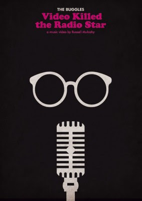
So I was going through my bookmarked design sites in an effort to get inspiration for Capstone and just creating work in general and I came across Well Medicated’s page about 25 Imaginative Illustrations Inspired by Film which have amazing posters. I personally am a fan of posters because I love the freedom that posters gives designers compared to other mediums that come with restrictions because of who their audience is. I really like the American Psycho poster and the way they used the illustrative effect to highlight the contrast between the characters expensive, high-rise apartment and him obviously being of the more noble, refined class versus the idea of him being a murderer. I also really like the Office Space poster. It’s so simple showcasing how a person could go crazy doing the same routine everyday that so many workers complain of to the point that they want to do damage. But it’s really nice because this action also applied in the movie; it looks sarcastic yet it’s what happened. The Pulp Fiction one I don’t like, I think its too much. And even though the movie was excessive, it worked as a whole movie where here I don’t think it does. Also, why is Jules blue? I don’t the point of him being blue and he looks like an avatar.


Oliver Munday


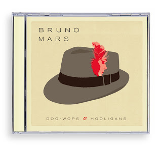
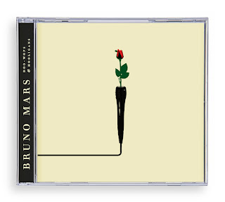
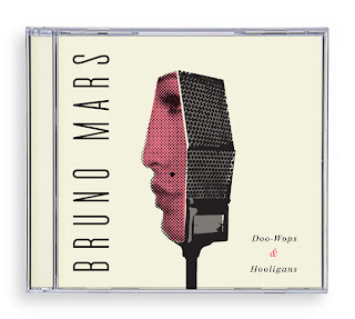
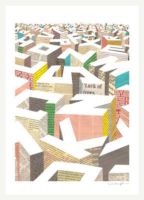
Lately I’ve been trying to become familiar with contemporary Graphic Designers work. In my research I came across Oliver Mundays website, which includes many of his amazing pieces. He’s done design work for the New York Times, Business Week, Wired, Time, etc. Most of his work is vector based and very structural. I wonder if he had some kind of training in Architectural drafting. His posters are my favorite. His attention to the negative space is very attractive. His book covers are also really cool. I advise you all to check out his great work!


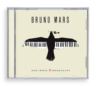
I found many of his CD covers done for Bruno Mars. I love his music, and I think that Oliver Munday has done a great job with capturing his personal style.

One of his works really grossed me out, called Fire in the Hole. He was able to construct an alphabet series made out of melted toy soldiers. But the placement of the dismantled appendages is what got me. Very clever idea indeed, especially at a time like this, but it is also kind of melancholy when one thinks of what dangers soldiers endure on an everyday basis in the war. It would work well in an Anti-war campaign, especially with its extreme and serious content.


Monday, May 23, 2011

A Little Hut


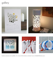
Patricia Zapata is a graphic designer, crafter and the author of Home, Paper, Scissors: Decorative Accessories for the Home. She started her blog (http://alittlehut.blogspot.com/) in 2005 as a way for her to get away from the computer and work on handmade projects. She also has a website where you can purchase some of her cut out creations. Her crafty life has slowly taken over and now she split her time between her design and crafty sides.


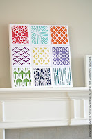
I stumbled onto Patricia Zapata’s blog after looking at her graphic design website and fell in love with many of her cut out illustrations. They are youthful and simplistic designs created using an exacto. It seems so simple, but can turn something as boring as a calendar into something unique and creative. The cut outs that she sells on her online store are very practical and can be created at home. She even has books that explain how to create similar designs. Her designs can be used as packaging, wall paper, and artwork.

Box of Crayons

Crayon Project by Katie Holloway

Since this class started I have re-discovered my stumble upon addiction, if you don’t have one I suggest you go to stumbleupon.com and develop one.

For this blog I have stumbled upon a very creative idea that I don’t do nearly enough. Find a different way to use an everyday product; yes I know my project basically is this but I like how this blog has everyone using the same material. The teacher gave all the students an assignment on the first day of class to take a box of 64 crayons and make something else using it. I think I think this is interesting because everyone has such different outcomes and ideas on what to do with their crayons. Some of them suck but there are some really creative ones. I think if I if I was given this assignment would either shave the crayons down and make something using the shavings or melt them like one of the students did. http://www.stumbleupon.com/su/2ndjeE/design.org/blog/design-re-thinking-tools

Little People - a tiny street art project


Ok...so I already blogged this week, but I found this blog and wanted to share!

http://little-people.blogspot.com/

One more thing to procrastinate on our final projects. Oh boy!

ilovedoodle


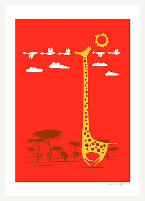
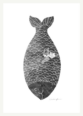
So I came across ilovedoodle.com recently and fell in love. Lim Heng Swee (aka ilovedoodle) is an illustrator living and working in Malaysia. His goal is to put a smile on your face with his designs, and I think he accomplishes this with flying colors. His designs are cute, clever, and (mostly) happy, reminding us that not all design needs to have a purpose other than joy. His simple style and thoughtful presentation adds to his talent as a designer and illustrator. You can really tell that he's doing more than designing--he's thinking. Lim Heng Swee's designs can be purchased as prints, t-shirts, and now on Thermos, further emphasizing the point that design can really reach outside of print and web. Check out his daily blog doodle everyday too--http://ilovedoodle.tumblr.com/

Sunday, May 22, 2011

Periodic Table of Typefaces

I was browsing the internet and saw this. I thought it was really funny since typography is so important to graphic designers, they have invented a Periodic Table of Typefaces. Many scientists have the Periodic Table of Elements to help them so why not make a Periodic Table of Typefaces to help out all the designers out there. Although this is not as practical as the Table of Elements for scientists it still is a clever way of putting together all the different fonts that designers might be working with. I really like how each typeface is typed out in its correct font so you can see how different they are from each other. They all have different weights, strokes and thicknesses while some are more scripty, serif or sans-serif fonts. This is definitely a fun way to look at the fonts we see and use on an everyday basis!

Sexy Sanitation Challenge

"Two and one-half billion people, more than a third of the world’s population, lack access to sanitation facilities and infrastructure, making them vulnerable to diseases from dysentery to cholera. Forty-five hundred children die each day from exposure to waste-borne bacteria and parasites, and yet the subject of sanitation is locked in a cultural privy, unmentioned, unmentionable, rarely rising above a dirty joke.

Acumen Fund, an organization dedicated to reducing global poverty, finds value in bringing overlooked subjects to light. Recently, it launched The Search for the Obvious by asking for photos of inventions so familiar they’ve fallen into the groove of modern existence. Among the printing presses, smoke alarms, folding chairs and lip balms that flooded the site, Acumen selected the picture of a sewer. “Okay, now you’re ready for a real challenge,” its website invited: “Sanitation is sexy. Make it obvious.”"

I'm not exactly sure that the campaign succeeded in making sanitation "sexy," but really, it doesn't need to be. It's a simple, important, and overlooked issue that is addressed with artistic fluency in the works of the challenge's winners. While in my opinion, the type moves too fast at a couple points in the "Shit talks, talk back" video, it is overall well animated, informative, and uses space and type quite well.
Smart Graphics.


A blog I frequently visit is blog.ISO50 by Scott Hansen (he also has a portfolio site with some truly awesome designs.). The blog features writings by other designers as well as Scott,  and this past week I saw a post about IBM’s smarter planet campaign. As I have said before, I am on a quest (an obsession really) to reduce my graphics to become as minimal as needed to make my point.

What I love about the photos below is the simple integration of graphics to represent the meaning. I went over to the IBM site’s Smarter Planet Campaign and found each section to be headlines by a great looking graphic.  I have not delved too deeply into the site, but what I loved about the look of each section’s imagery is that I feel there is a degree of respect given to what Paul Rand created back in the late fifties when he re-designed the company’s identity. Rand was fantastic at the use of minimal imagery to make a point or create a look for a company.  I am also glad to see a major company taking such dedication to graphic design and not going with a pointless photo-manipulated mess (not to imply there are not others, but still nice they are doing the flat graphic thing I love so much). 


Level Ground Trading Identity and Packaging Design

In an effort to create a cohesive and kick-butt identity for my father’s new tea “store” I have been searching for interesting inspiration. As his designer it is my job to create all aspects of design for his business. This includes the logo, business cards, letterheads, packaging, labels, and the works! His business concept is one that is quite different than the norm. He is not just opening a tea shop, he is opening a self-service “cantina” which will have the ability to be dropped into any existing store and create profit margins. Not only is the concept great for the owner, but it is also wonderful for the buyer because only organic teas will be offered and they will be sold at prices significantly below those of tea retailers and cafes. With that said it has been difficult for me to come up with a design that would work within the confines of a separate business. It can’t be too flashy, but it also needs to stand out as its own entity.

In an effort to find inspiration, I have been searching for other identities that are in a similar business. One that I came across is called Level Ground Trading which is a fair trade company. Their identity and packaging designs are incredibly beautiful. I am especially inspired by the typography which is printed straight on the bag (on the back). The images are also phenomenal.