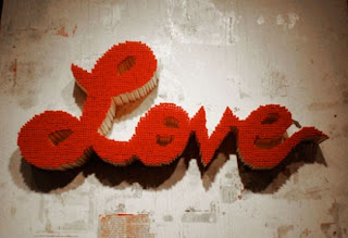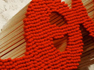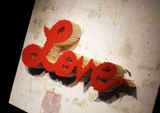
I came across this graphic design text installation piece. I feel that this is a great example that is similar to what I will be presenting for the capstone piece. This installation is a word. The stylized font is created by stacking together several matches. The use of these materials not only adds dimension to each letter but a very interesting texture and color is added to the piece. I feel that the color and the overall usage of materials does great things especially the way that these elements seem to go along very well with the ideas that can be represented by the word “love”.
Not only does this piece appeal to the senses, but I also wonder if part of the exhibition could be to actually ignite flame to the piece! One of the reasons I am so attracted to the use of tangible materials in design is the vast amount of possibilities that come into play during the process of crafting and creating!


This is pretty cool because I feel like the matches reference the fact that love can ignite quickly, and burn away just as fast. I think whoever made this knew exactly what she or he was doing!
ReplyDelete