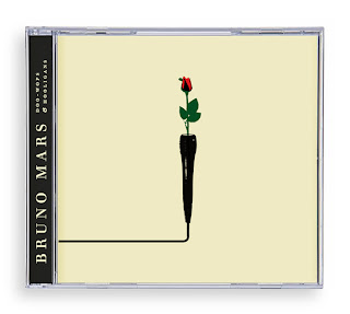
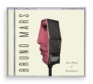
Lately I’ve been trying to become familiar with contemporary Graphic Designers work. In my research I came across Oliver Mundays website, which includes many of his amazing pieces. He’s done design work for the New York Times, Business Week, Wired, Time, etc. Most of his work is vector based and very structural. I wonder if he had some kind of training in Architectural drafting. His posters are my favorite. His attention to the negative space is very attractive. His book covers are also really cool. I advise you all to check out his great work!
I found many of his CD covers done for Bruno Mars. I love his music, and I think that Oliver Munday has done a great job with capturing his personal style.


One of his works really grossed me out, called Fire in the Hole. He was able to construct an alphabet series made out of melted toy soldiers. But the placement of the dismantled appendages is what got me. Very clever idea indeed, especially at a time like this, but it is also kind of melancholy when one thinks of what dangers soldiers endure on an everyday basis in the war. It would work well in an Anti-war campaign, especially with its extreme and serious content.

No comments:
Post a Comment