Tuesday, May 31, 2011
Sebastian Onufszak
Patterns

As our last week of school nears I can help but think what the hell am I going to do with my life. I don’t think I have ever been more stressed in my life and I’m starting to panic. But on a happy note my project looks better than I could have imagined and I can’t wait to install it.
I came across 2 things I wanted to share for this week’s blog one is this Icon generator you can put any word into it and it creates the word using logos and Icons from other companies and places. It’s probably illegal but it looks cool http://www.stumbleupon.com/su/1RCtq9/iconscrabble.com. The other is these 3d glass paintings which some of you may have seen before but they’re amazing. He takes a bunch of different panels and then paints each one a little different so when he puts them all together they form one giant thick 3d painting. I thought that it was an interesting approach to the world of painting in 3d. http://www.stumbleupon.com/su/2GR90O/www.visualnews.com/2011/01/04/3d-paintings-on-panes-of-glass
Monday, May 30, 2011
What I Hate About Becoming a Designer
1. Seeing Everything Through a Designer’s Eyes
This is the biggest change for me. The more I get into and learn about design the harder I find it to enjoy simple things. Now I try to analyze everything in a critical manner seeing what could be done to improve upon it.
Here’s a few examples of how my thought process has changed.
Playing a Video Game
- A Year Ago – Kill the Covenant.
- Today – I really like this color brown for the Master Chief, this soft blue would compliment his armor well.
Watching a Movie
- A Year Ago – Opening Credits -> Movie Logo -> Movie -> The End.
- Today – Opening Credits -> Movie Logo What font is that? Is it scalable? Would it look good in greyscale? It might be better if … -> Movie -> The End.
Seeing Comic Sans in Use
- A Year Ago – What a cool looking font! I like how they used it in 5 different colors and with 10 others fonts also.
- Today – A little smile comes across my face as I remember my previous reaction, I roll my eyes and quickly turn away.
Taking a Picture
- A Year Ago – Point -> Click
- Today – Point -> Check my framing. Apply Rule of Thirds. Any distracting elements? Check depth of field. -> Click
2. Keeping Up With the Jones’
In this designer/blogger world there are always newer, shinier toys to be purchased and other people doing some amazing things that you would like to be doing.
Buying a Computer
- A Year Ago – I can just get a few parts and upgrade my PC.
- Today – I need an iMac for the house, a MacBook Pro for serious work, and a MacBook Air for taking to cafes.
Darren Rowse, David Airey, Elliot Jay Stocks, Brian Clark, Naomi Dunford, Crystal Clayton, Collis Ta’eed, Maki, Lisa Bettany, Seth Godin.
- A Year Ago – Who?
- Today – I hope to one day meet these people that have educated, entertained and inspired me. And maybe even do the same for them.
3. Time Management
Time is one of those things that you never have enough of. Since makings strides at being a designer I find myself spending a large portion of my free time doing some design or blog related things.
Free Time
- A Year Ago – Watching a movie or playing some video games
- Today – Reading RSS or design book, working on a project, chatting with a client or potential client, blogging.
New Website Visits
- A Year Ago – Usually takes about 2 minutes to accomplish whatever it is I needed.
- Today – Now it takes about 10 because I now thoroughly critique all aspects, Color, Navigation, Usability, Standards Compliance and Logo Design. If I like the design I bookmark and tag it. If it does something that I’m not familiar with I dissect the code until I understand what was done.
Feeds to Read in My RSS Reader
- A Year Ago – 0
- Today – 95 and counting
Domains to Maintain
- A Year Ago – 0
- Today – 9
I Don’t Actually Hate Being a Designer
If that were entirely true it’s not something I would be working hard at. Thus far it has been very rewarding and I look forward to my future, but it is a lot of work. I don’t have as much free time as I use to but I also feel much more profitable with my time than a year ago. I use to spend hours a day playing an online role-playing game. I haven’t logged onto my character since Christmas. I might not be the world’s greatest Black Mage because of this decision, but I have gained so much more by learning new skills and meeting great people.
I truly believe this is only the beginning and that the best it yet to come.
Two Great Designers and Some Words on Design
Saturday, May 28, 2011
Airport Passenger Tunnel
Wednesday, May 25, 2011
Film Posters
Oliver Munday
I found many of his CD covers done for Bruno Mars. I love his music, and I think that Oliver Munday has done a great job with capturing his personal style.
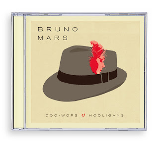
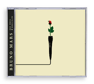
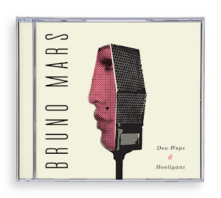
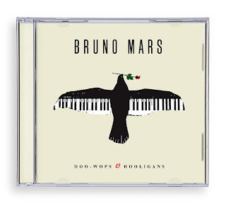
One of his works really grossed me out, called Fire in the Hole. He was able to construct an alphabet series made out of melted toy soldiers. But the placement of the dismantled appendages is what got me. Very clever idea indeed, especially at a time like this, but it is also kind of melancholy when one thinks of what dangers soldiers endure on an everyday basis in the war. It would work well in an Anti-war campaign, especially with its extreme and serious content.
Monday, May 23, 2011
A Little Hut
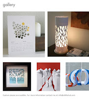
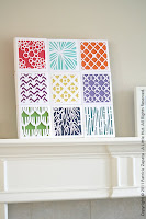
Patricia Zapata is a graphic designer, crafter and the author of Home, Paper, Scissors: Decorative Accessories for the Home. She started her blog (http://alittlehut.blogspot.com/) in 2005 as a way for her to get away from the computer and work on handmade projects. She also has a website where you can purchase some of her cut out creations. Her crafty life has slowly taken over and now she split her time between her design and crafty sides.
I stumbled onto Patricia Zapata’s blog after looking at her graphic design website and fell in love with many of her cut out illustrations. They are youthful and simplistic designs created using an exacto. It seems so simple, but can turn something as boring as a calendar into something unique and creative. The cut outs that she sells on her online store are very practical and can be created at home. She even has books that explain how to create similar designs. Her designs can be used as packaging, wall paper, and artwork.
Box of Crayons
Since this class started I have re-discovered my stumble upon addiction, if you don’t have one I suggest you go to stumbleupon.com and develop one.
For this blog I have stumbled upon a very creative idea that I don’t do nearly enough. Find a different way to use an everyday product; yes I know my project basically is this but I like how this blog has everyone using the same material. The teacher gave all the students an assignment on the first day of class to take a box of 64 crayons and make something else using it. I think I think this is interesting because everyone has such different outcomes and ideas on what to do with their crayons. Some of them suck but there are some really creative ones. I think if I if I was given this assignment would either shave the crayons down and make something using the shavings or melt them like one of the students did.
Little People - a tiny street art project

Ok...so I already blogged this week, but I found this blog and wanted to share!
http://little-people.blogspot.com/
One more thing to procrastinate on our final projects. Oh boy!
ilovedoodle

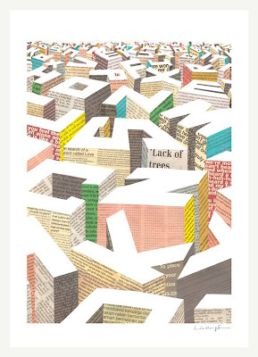
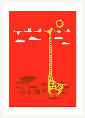
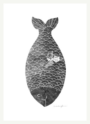
So I came across ilovedoodle.com recently and fell in love. Lim Heng Swee (aka ilovedoodle) is an illustrator living and working in Malaysia. His goal is to put a smile on your face with his designs, and I think he accomplishes this with flying colors. His designs are cute, clever, and (mostly) happy, reminding us that not all design needs to have a purpose other than joy. His simple style and thoughtful presentation adds to his talent as a designer and illustrator. You can really tell that he's doing more than designing--he's thinking. Lim Heng Swee's designs can be purchased as prints, t-shirts, and now on Thermos, further emphasizing the point that design can really reach outside of print and web. Check out his daily blog doodle everyday too--http://ilovedoodle.tumblr.com/
Sunday, May 22, 2011
Periodic Table of Typefaces
 I was browsing the internet and saw this. I thought it was really funny since typography is so important to graphic designers, they have invented a Periodic Table of Typefaces. Many scientists have the Periodic Table of Elements to help them so why not make a Periodic Table of Typefaces to help out all the designers out there. Although this is not as practical as the Table of Elements for scientists it still is a clever way of putting together all the different fonts that designers might be working with. I really like how each typeface is typed out in its correct font so you can see how different they are from each other. They all have different weights, strokes and thicknesses while some are more scripty, serif or sans-serif fonts. This is definitely a fun way to look at the fonts we see and use on an everyday basis!
Sexy Sanitation Challenge
Acumen Fund, an organization dedicated to reducing global poverty, finds value in bringing overlooked subjects to light. Recently, it launched The Search for the Obvious by asking for photos of inventions so familiar they’ve fallen into the groove of modern existence. Among the printing presses, smoke alarms, folding chairs and lip balms that flooded the site, Acumen selected the picture of a sewer. “Okay, now you’re ready for a real challenge,” its website invited: “Sanitation is sexy. Make it obvious.”"
I'm not exactly sure that the campaign succeeded in making sanitation "sexy," but really, it doesn't need to be. It's a simple, important, and overlooked issue that is addressed with artistic fluency in the works of the challenge's winners. While in my opinion, the type moves too fast at a couple points in the "Shit talks, talk back" video, it is overall well animated, informative, and uses space and type quite well.
Smart Graphics.
Saturday, May 21, 2011
An Examination of Minimalist Design
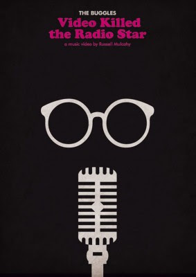
"Minimalism in design has been around for some time, and today it seems to be a welcome alternative to overly busy and unnecessarily cluttered websites, posters, ads, and logos. For those new to this art form, the concept of minimalism is mostly concerned with stripping away excess and strategically placing remaining elements. The result can be a calming, yet powerful design that is streamlined to convey its message. You can find minimalism in all art forms, from architecture to fashion to logo design.
To get the most out of a minimalist design, whether it be for something as small as a logo or large as a billboard, be sure to use the right elements correctly. Color, layout, white space, graphics & typography all play an important role in minimalism.""In minimalist design, color choice is strategic and the amount of colors used, should be kept to a minimum. Black, grey and white are the most powerful colors and allow for a single accent color to have a greater impact. All colors are acceptable if they are used properly; however, the colors with the greatest contrast are generally used together. Therefore, most designers choose bold and bright primary colors for minimalist design."
"A minimalist design layout is especially challenging because every element with which you are working, is essential. Content for websites and posters for should be laid out in such a way that the viewer can find what they need without much thought. In other words, the page should make sense."
"Negative space serves to give power to the small bits of information that it surrounds. The greater the empty space, the more power an object within it gains. Negative space also serves to structure a group of elements and create balance."
"The use of images in minimalism is very intentional. Designers choose graphics for their effectiveness and in minimalist design use them when the image is more effective than a written message. Graphics should be used sparingly and strategically, and should be relevant to the topic."
"Typography in minimalism should be just as strategic as any other element. In any design including minimalism, no more than two or three styles of fonts are appropriate. Many designs use one font for headlines, one for body, and possibly one for navigation on websites or for any special text or subheadings. Usually more than three types makes the design look cluttered and hard to understand."
"In the last ten years, minimalist website design has become quite trendy. Unfortunately, some designers have misunderstood the idea behind minimalism and create web pages void of content that simply don’t make sense. However, at the root of the minimalist movement, great designers have created stunning websites that are not only pleasing to look at, but are also easy to navigate. While minimalist design is not practical nor thematically possible for every every website, those websites that can use it should take advantage."
"Brochures, packaging, and ad campaigns have all seen their share of the minimalist design. However, it is in posters and logos that you see it really take hold. Many designers choose to use this streamlined design for everything from movie posters, to band posters, to ad posters. The reason for this is the effectiveness of conveying a strong message quickly and cleanly. Used correctly, minimalist posters are designed to use each of its elements to send one message. The result is usually a poster that is not only functional but also aesthetically pleasing."
"Minimalism in logos is an important concept, since the purpose of a logo is to be easily remembered and associated with a company. As a result, minimalist logos are often the most popular type of logo design since it keeps the logo simple enough to be memorable. The tricky part of a minimalist logo is to make a design that is easily recognized for the company it represents, while also reflecting the brand’s goals."
Friday, May 20, 2011
GOOD (literally)
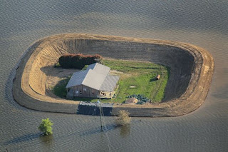
Reading their website is like reading only the really cool news.
More specifically to design, I love their infographic section. They cover everything from politics to business to food to the LED light and everything in between. Now I realize that this isn't my first post about infographics....(maybe I'm doing the wrong capstone project??) but this site is definitely worth checking out.
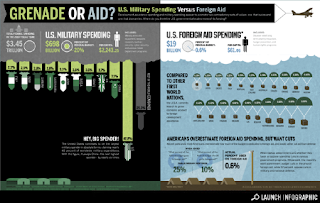
And if you want to move to Los Angeles.... they're hiring!
Tuesday, May 17, 2011
Gradients

This blog has some really great points about using gradients in design, which is many times something that I forget about. I've used them before and they really can make a difference. It gives real depth to an image, like a logo or icon. It can also draw attention to an area, functioning much like a sort of auto-light/dark. A lot of her examples look really neat, though I wish I could see a copy of them without a gradient to compare. I also love her little tutorial about how to make a cool splatter gradient. I think it has a sort of science/futuristic appeal to it; it's more modern.
If nothing else, just check out the pics. Creative Curio really is a cute blog!
Monday, May 16, 2011
Motel text! (AKA apparently 1992 is the future now.)
Not to be confused with "Rubik", which turns everything it tags into an immensely frustrating match-up puzzle.
I was talking with a friend just now and he linked me to the Wikipedia page for Philip K. Dick's novel Ubik:
The novel takes place in the "North American Confederation" of 1992, wherein technology has advanced to the extent of permitting civilians to reach the Moon and psi phenomena are common. The protagonist is Joe Chip, a debt-ridden technician for Glen Runciter's "prudence organization", which employs people with the ability to block certain psychic powers (as in the case of an anti-telepath, who can prevent a telepath from reading a client's mind) to enforce privacy by request. Runciter runs the company with the assistance of his deceased wife Ella, who is kept in a state of "half-life", a form of cryonic suspension that gives the deceased person limited consciousness and communication ability.
The story sounds trippy as hell and I kind of want to check it out now, but the first thing that caught my eye was the cover, which I think is a really striking cover design. Usually that vertically-oriented text (which I think Shiro refers to as "motel text" or something like that) tends to look weird to me, but I think it actually works really nicely here. It probably has something to do with the fact that the letter widths are approximately the same size, so it produces this nice hefty text block that fits well with the spray can illustration. The limited color palette is also effective here, and the saturation of the red paint spray is counterbalanced by the heaviness of the title text (despite its pale yellow coloration).
What do you guys think? Does the vertically-oriented text ever bother you here or elsewhere? Do you like this cover?
Dr. Jorge Alderete
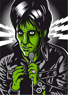
Alderete has quickly won me over as one of my favorite designers. I found out about him rather recently, from his being featured in a book I enjoyed immensely (and keep over referencing), Latin American Graphic Design. He is an Argentinian designer who has built his career in Mexico. His most characteristic style is a thick lined, bold colored comic illustration, with seamless decorative typography promoting an event or idea. He references pop culture often: particularly 50's B-movies, rock music, retro Hawaiian kitsch, and Mexican cultural icons, like sugar skulls and luchadors. He is often commissioned to make promotional materials for events, galleries, and bands, especially Lost Acapulco, a surf band who is a recurring client.
CONTEMPORARY DIGITAL ART AND THE “MALE GAZE” (Part Two)
CONTEMPORARY DIGITAL ART AND THE “MALE GAZE” (Part One)
::Text Installation::
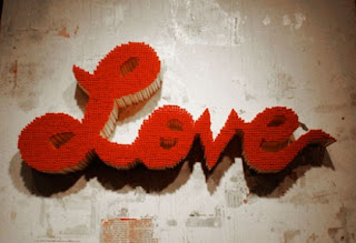
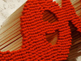
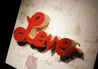
I came across this graphic design text installation piece. I feel that this is a great example that is similar to what I will be presenting for the capstone piece. This installation is a word. The stylized font is created by stacking together several matches. The use of these materials not only adds dimension to each letter but a very interesting texture and color is added to the piece. I feel that the color and the overall usage of materials does great things especially the way that these elements seem to go along very well with the ideas that can be represented by the word “love”.
Not only does this piece appeal to the senses, but I also wonder if part of the exhibition could be to actually ignite flame to the piece! One of the reasons I am so attracted to the use of tangible materials in design is the vast amount of possibilities that come into play during the process of crafting and creating!
Posters


Lately I've been really interested in poster design and the virtual creative freedom that artists have when creating them. Posters to me are supposed to highlight whoever or whatever is being showcased and because of this I feel as if they allow all types of creative solutions without all of the 'rules' that are associated with more publicly seen mediums. I went on a field trip a little while ago with another class and the designers there really enjoyed creating posters because they found that even though it didn't bring in too much revenue it allowed them almost total freedom to just design something they find interesting; to create ideas they want without too many restrictions from the client. I forgot that when you work in a bigger company your ideas get sanded down and compiled with everyone else's so that it no longer becomes your idea anymore, so I find this type of work to be a good solution to keep creative juices flowing. So I found a site that showcases some pretty amazing posters, their are hundreds of site online for this type of thing, but I just stumbled upon this one and I'm impressed. All of these posters give me different reactions to every idea that is being portrayed, but they are all unique and I think reflective of each theme. Above are some of the posters showcased on the site: the first I love because of the futuristic, modern look, yet surreal at the same time. It almost looks as if it's moving, like it's floating. The second, I really just enjoy looking at because of the hidden faces within the pattern. At first glance you just see this repetitive design, but then you notice the two faces and the whole poster changes and I find myself looking at between the two forms. The last one I love because of course it's colorful and bright and everyone knows how I love color. I stare at this and want to know how they did it which is fitting because it's a poster for tuts+, the design teaching website.
Here's the link, check it out!
http://speckyboy.com/2010/08/10/30-creative-and-inspiring-poster-designs/
Girl Effect
I love this video's message and design. It deals with girls in developing countries, and what their lives are like. There no talking just typography, icons, music and animation. All these elements put together create an amazing message. I love how they tell the story by first showing how a girl’s life is and then how your help impacts her life and ultimate the world. I feel that this video is more success in SHOWING people the result of their help as opposed to just telling them. This is why design is so important. I feel that this video creates a more powerful and moving message than just telling people about. Designing this story took a lot of creativity and work. The icon of the girl used in the video is shown throughout the campaign, and it proves to be successful. On regards to the organization I feel that it is an amazing idea, and I want to physically go there and rescue all those girls that have no choice. But the way we can help is by investing in one girl, as the video shows us. Do you think this icon style works with the campaign? Is everyone over doing it?
strong or weak?
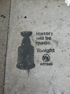
I saw this on the sidewalk in front of the post office on sheffield, near the depaul bookstore. when i first saw it, i thought it was pretty cool. stencil street art, guerilla advertising and all that jazz. however, i walked away, but then i walked back to look at it again because i thought it was lacking information. What did they mean by history? Who was playing? plus, when is tonight? i had no idea when that was put there and how long it has been there for. i think that a few more pieces of info would have made it stronger advertising. also, i know that maybe they wanted you to see that and then look it up online, but if you saw it the day after, it would then be a mute point because it would be no longer relevant.
One more thing... do we know if that was put there professionally? or by a fan...?
Creative Suitcase Makes an Impact
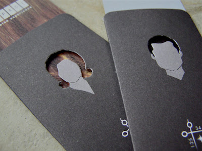

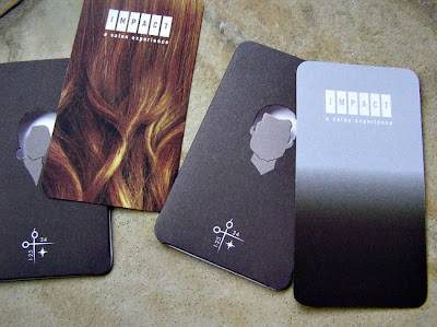
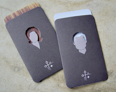
So I stumbled across these cool appointment/business cards for Impact Hair Salon on cardflare.com, a website providing daily inspiration for business cards. When you remove or insert the card into the sleeve, the woman's hair changes from straight to wavy and the man's hair changes from gray to black. The reverse of the cards are simple and effective, showing the salon's 50's style. I appreciate the usefulness as well as the interactivity of these cards--not only will they help clients remember their appointment dates, but they're fun and clever too. I think it's important for businesses to invest in designs like this because if I received one of these cards, I'd show it to my friends, and what better way to spread the word about your business than by having unique design collateral. It really shows a level of care and awareness. The cards were designed by a Texas based design firm called Creative Suitcase that has nice, clean design with a pretty wide range of clients. Worth checking out: http://www.creativesuitcase.com/
Sell Outs @ Chicago Street Art Show
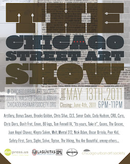 Over the weekend I was able to make a spontaneous trip out to Pilsen to check out The Chicago Street Art Show; really cool stuff! It made me feel really 'artsy' (sorry to sound super cliche, and therefore, definitely not 'artsy') to actually recognize a bunch of the artists there.


